
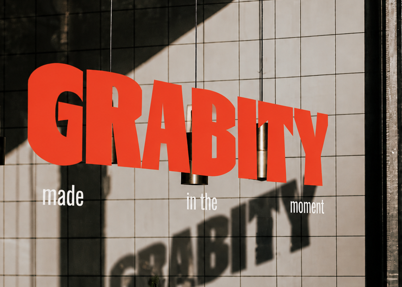
A bold burger brand built around movement, energy and urban culture. We developed the identity and visual language to feel raw, expressive and unapologetically youthful.
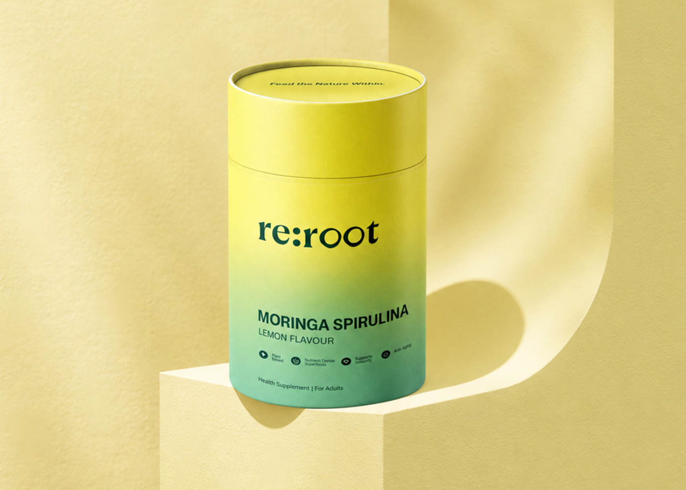
A modern wellness brand bringing a more considered approach to everyday nutrition. We created a clean, tactile identity and packaging system that balances natural cues with a contemporary feel.
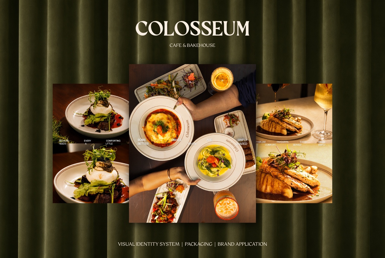
A contemporary dining concept built around a generous, social approach to food. We developed the brand identity and visual language to bring together the richness of the cuisine with a more modern, confident personality.
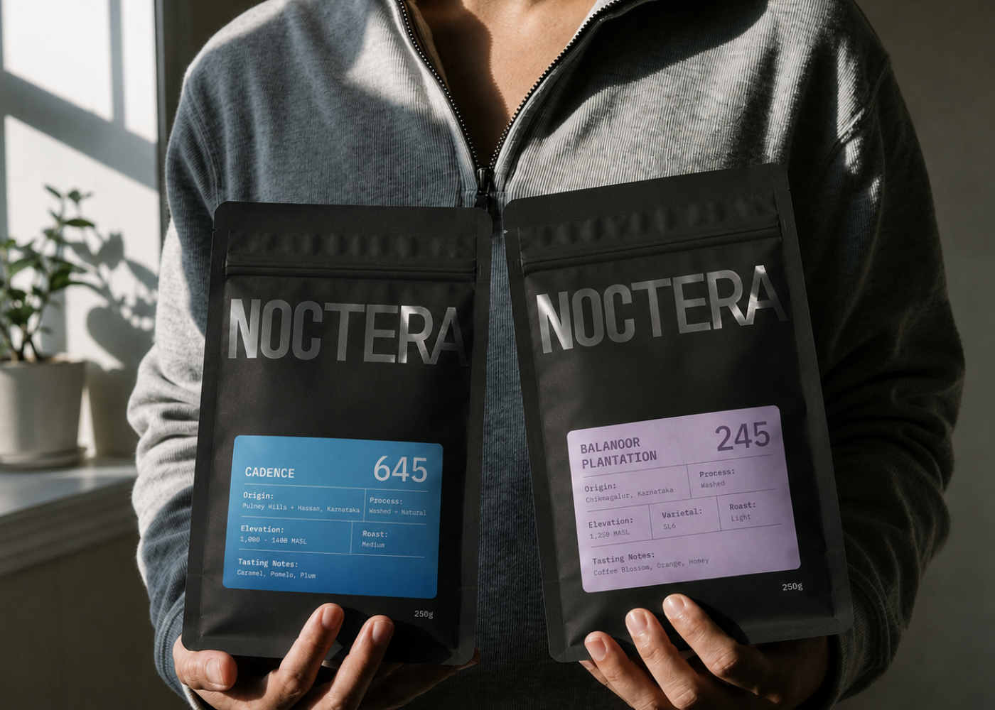
A specialty coffee brand focused on the ritual and craft behind a good cup. We created a dark, distinctive identity and packaging system that gives the brand a strong presence while keeping it rooted in coffee culture.
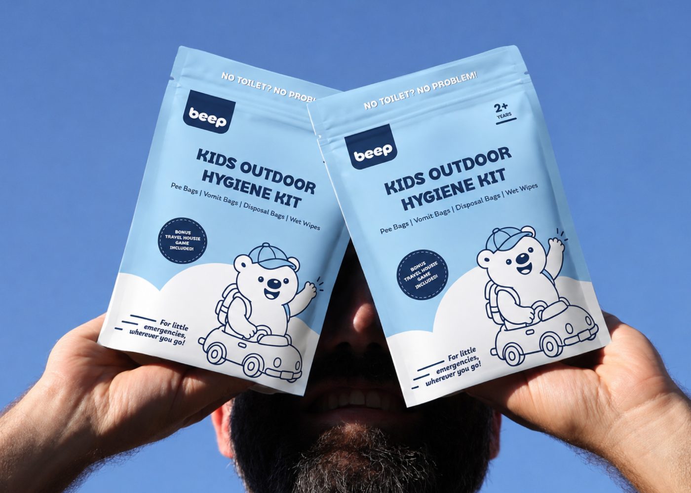
Beep is a kids’ outdoor hygiene brand created to make everyday adventures easier for children and less stressful for parents
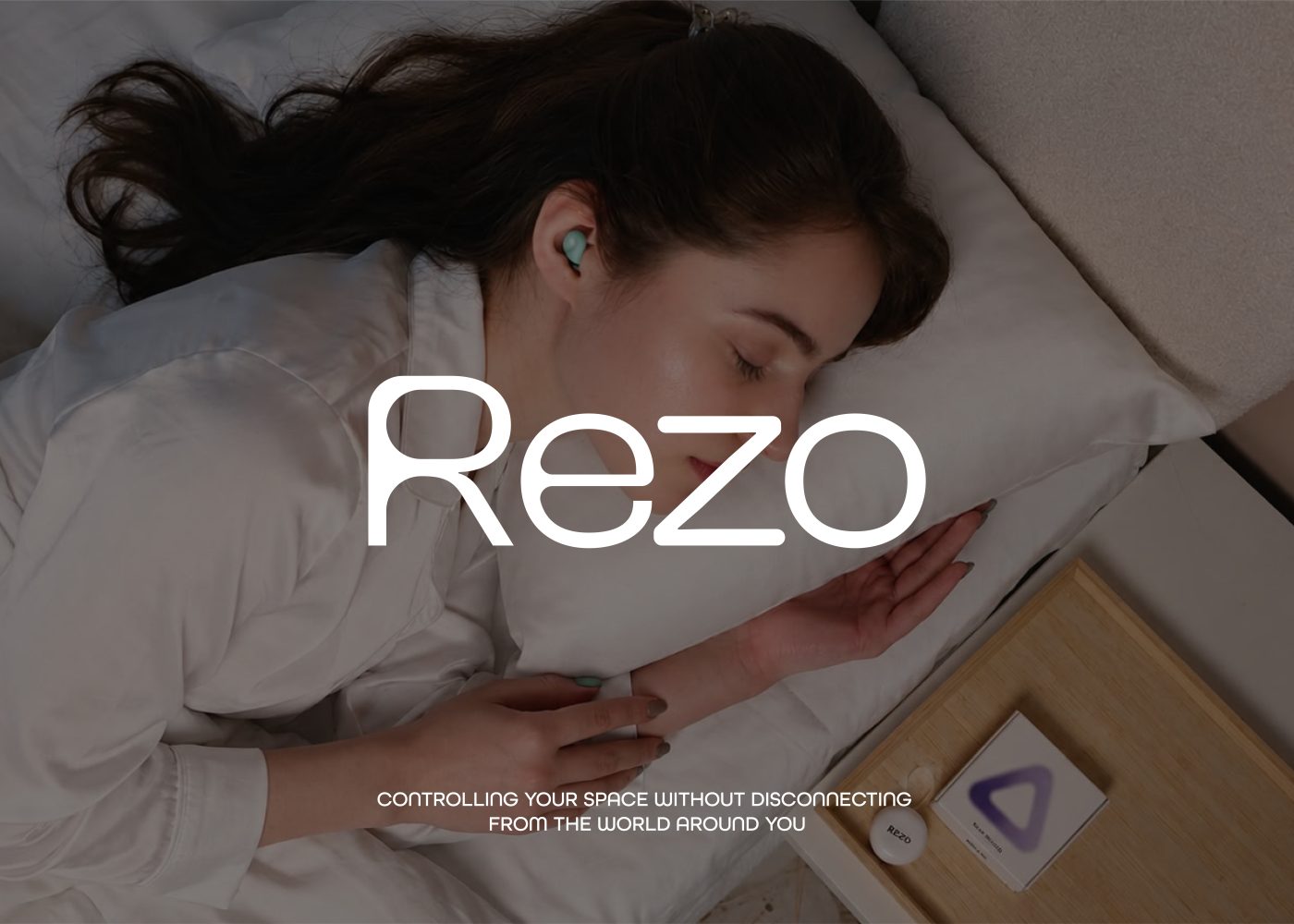
A modern lifestyle brand centred around better everyday living. We developed its identity and communication system to feel calm, contemporary and considered, creating a visual world that works across both product and digital.
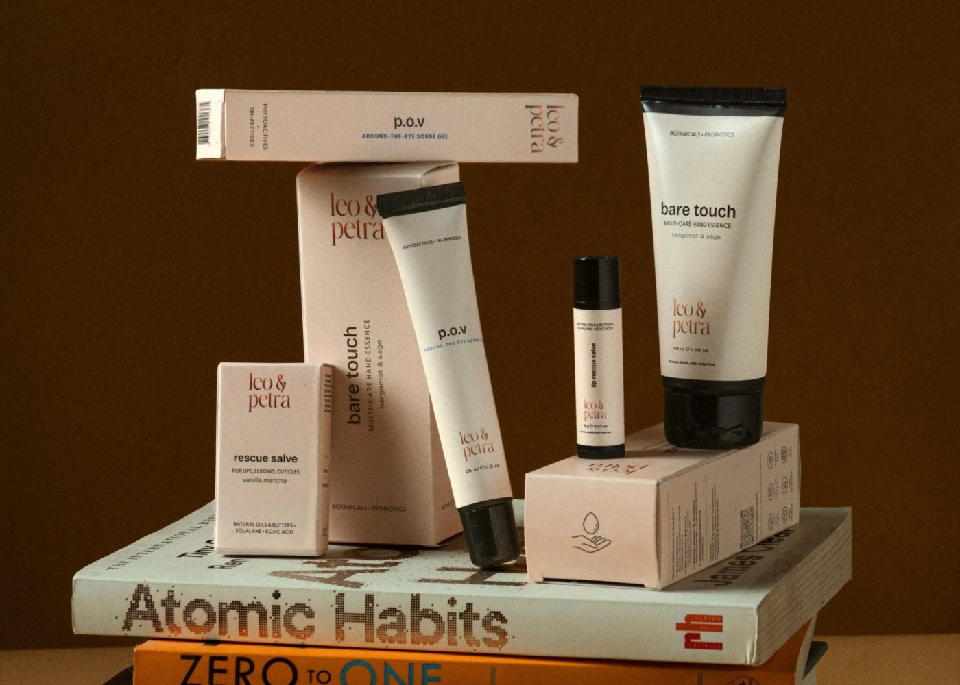
Built for a skincare brand balancing science with softness. The identity leans into clarity and restraint—designed to feel considered, not cosmetic.
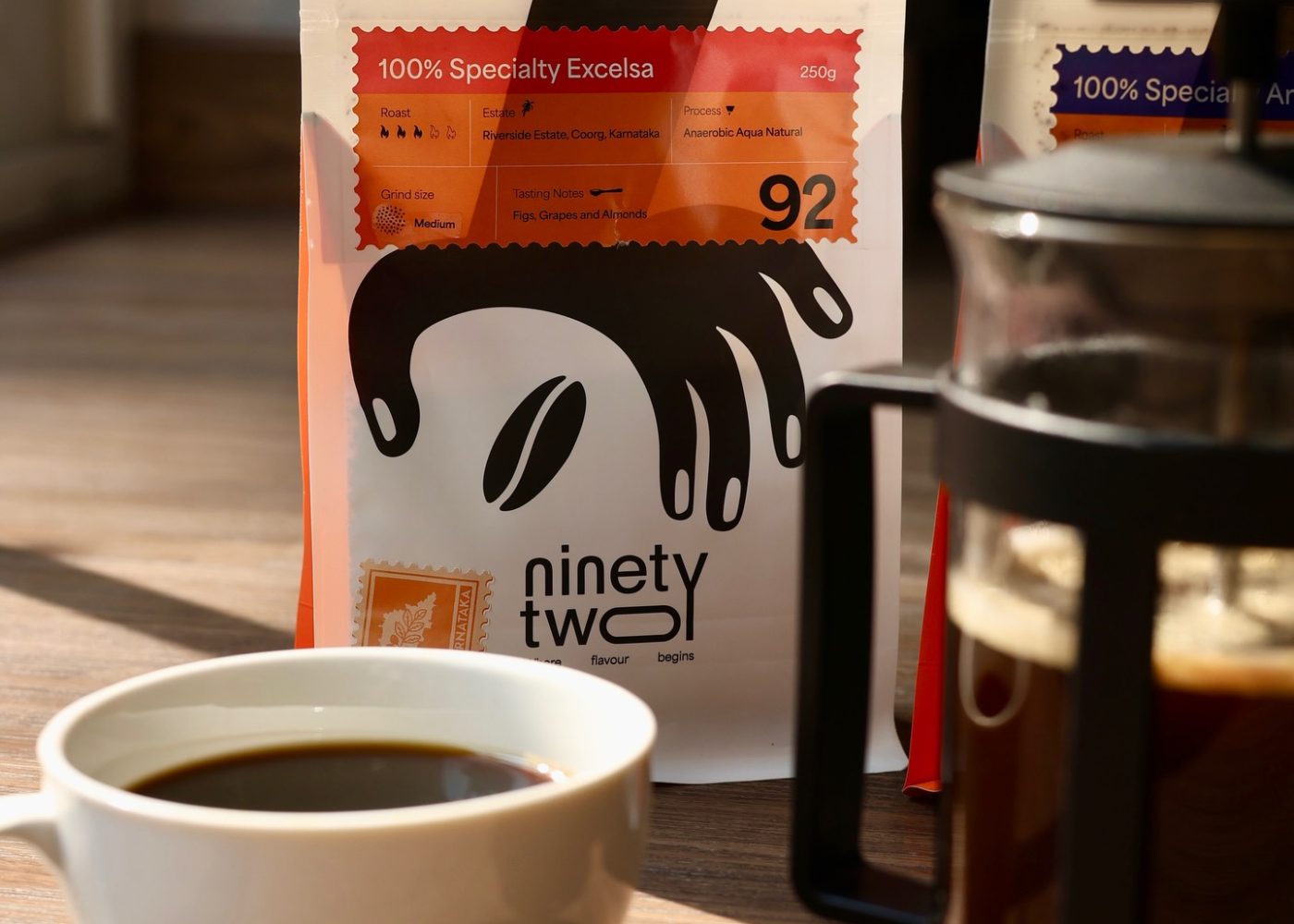
A specialty coffee brand designed to feel grounded yet elevated. Every element—type, tone, and packaging—works to build a quiet, confident presence.
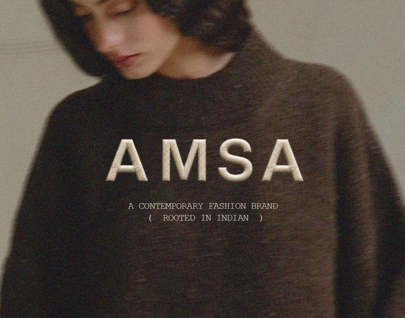
Built around quiet expression and everyday individuality. We developed a minimal identity and visual language that lets the clothing and attitude take centre stage.
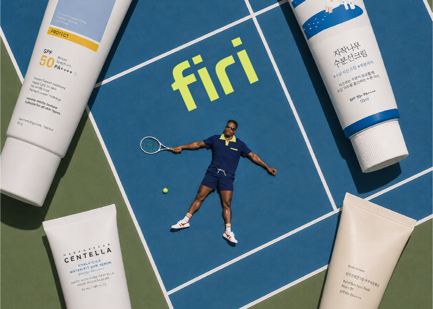
We created a playful yet considered identity and packaging system designed to make the brand feel approachable, confident and contemporary. Every element—type, tone, and packaging—works to build a quiet, confident presence.
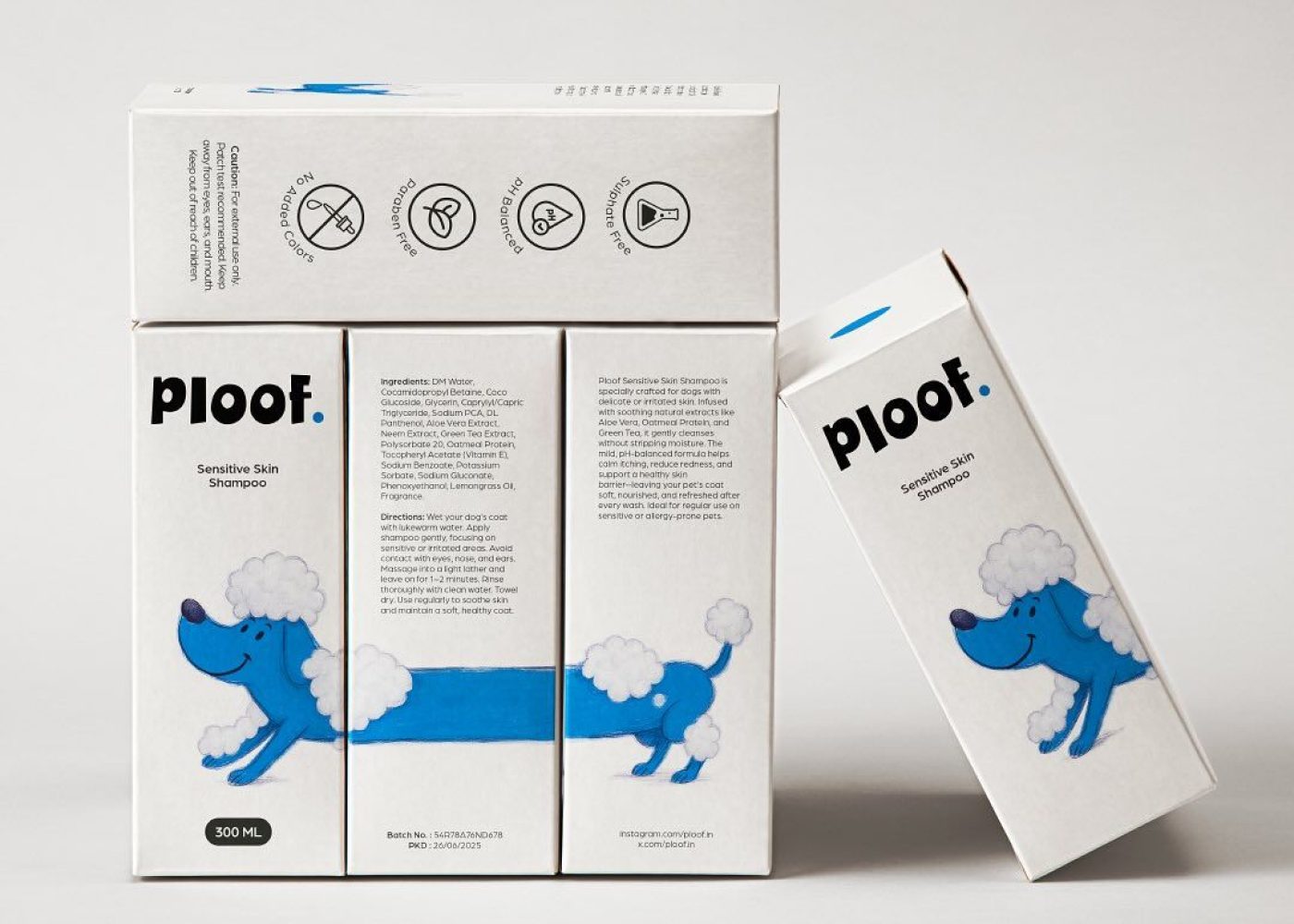
A playful identity built without losing structure. Designed to scale across products, communication, and a growing brand world.
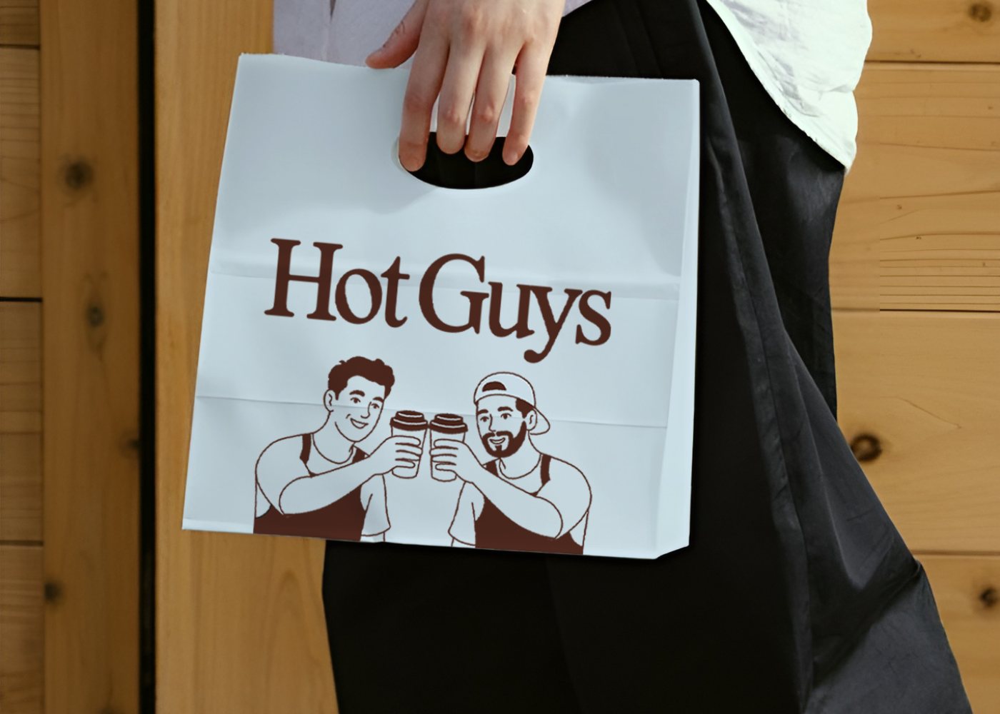
A cafe with a bold personality and an equally bold point of view. We developed the identity and packaging around humour, character and a visual language designed to stand out on shelf and in culture.
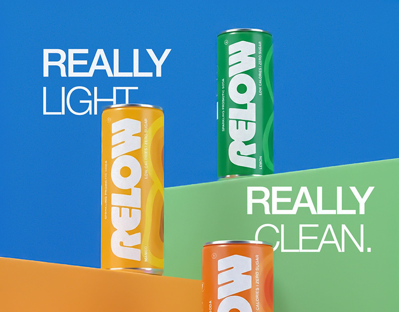
A functional everyday product presented through a lighter, more expressive lens. We developed the identity and packaging to make the brand feel clean, contemporary and refreshingly straightforward.
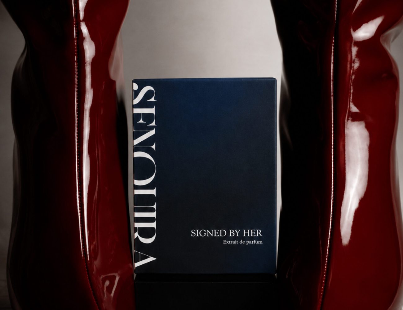
Senquira was designed to stay there long after. From the visuals to the packaging system, every detail was crafted to feel sensual, cinematic, and deeply intentional — balancing elegance with bold femininity.
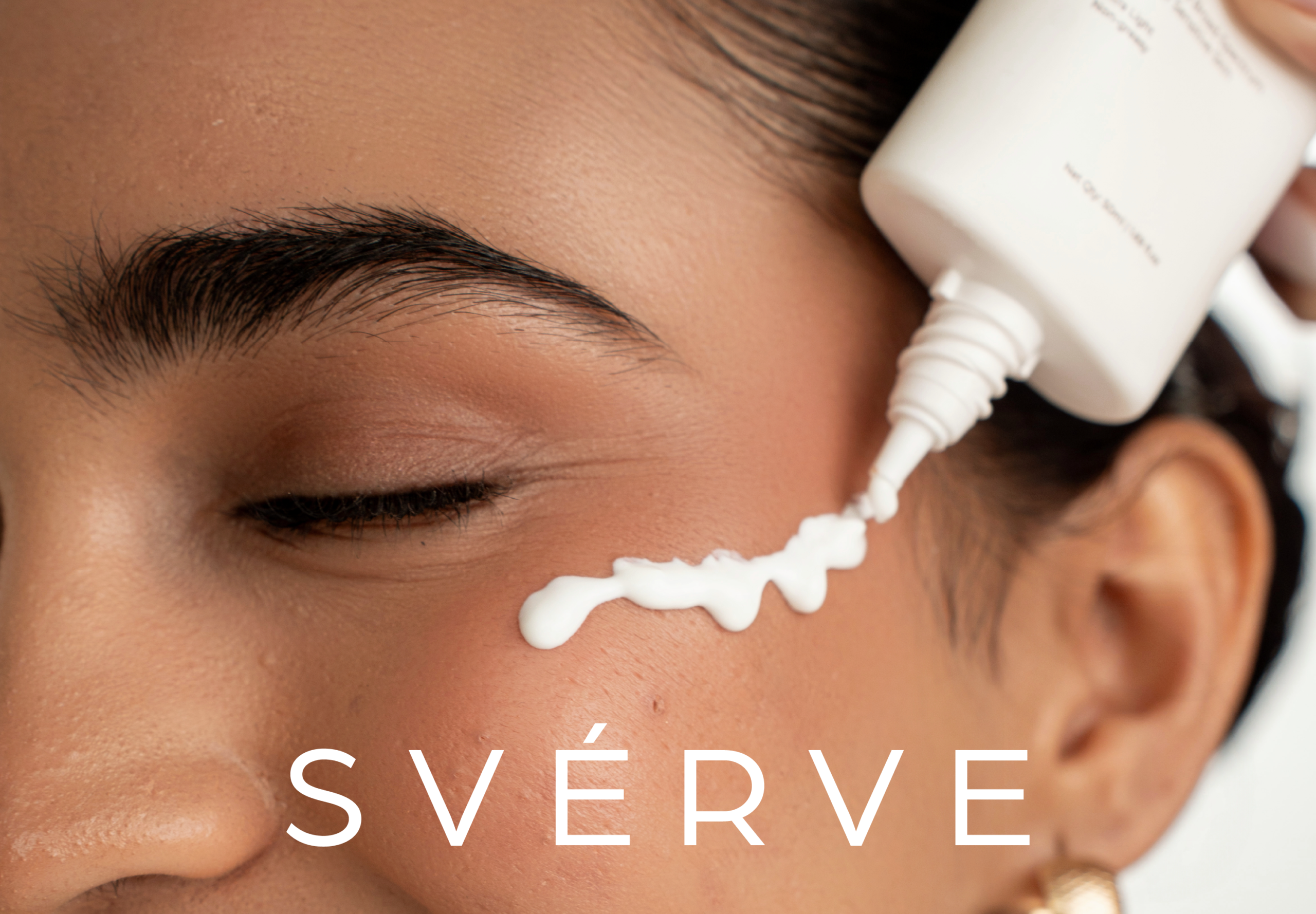
A skincare brand focused on simplicity, efficacy and everyday beauty. We developed a clean and refined identity and packaging system that puts the product and its formulation at the centre.
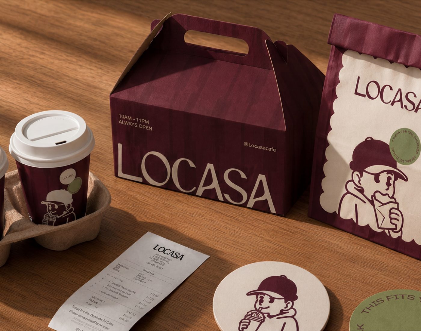
A hospitality brand built around the feeling of familiarity, comfort and coming together. We created a warm and characterful identity that translates across the space, communication and customer experience.